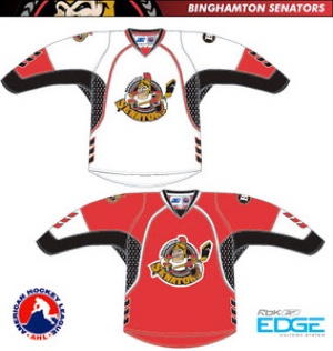
Two new designs in from the AHL. First up, the Binghamton Senators:
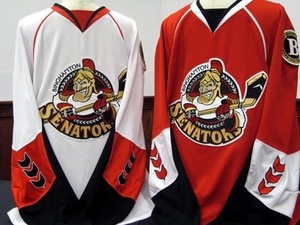
What are those things on the sleeves? I’m sure they make sense to someone, but what the? Here, they look silly in the real world too.
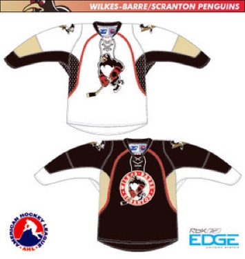
Looks like they are hiding their junk. So, sleeves bad. Next up, the Wilkes-barre / Scranton Penguins.

Doesn’t look too awful, right? Wrong!
Did someone forget to mention that the jerseys were going to be smaller and more streamlined to the Penguins? Wow, that patch is enormous. Dud doesn’t look super happy to be modeling it either.
One tough looking Penguin. Unlike this one.
More to come. Images from the AHL website. Enjoy.


2 responses to “Your AHL Jersey Update for Today”
I believe those things on the sleeves are supposed to be the same pattern that was on the sleeves and hem of the old third jerseys that were black. They’re supposed to be ivy vines or something like that.
I’ve figured out that Baby Pens jersey. If you squint a little or move your head rapidly back and forth or side to side (simulating game action, of course), it’s a giant bullseye!! Apparently, goaltending isn’t what it used to be in Scranton…