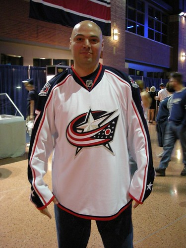
Before the first round was complete, it was time to leave, as hunger and annoyance was starting to set in (How freaking long can one round take?) On the way out, I decided to stop and check out the new Blue Jackets jerseys. They even let me try one on.
(Click on any picture to make it larger, if you can stand it)

It makes me look like I have no hair. What is this? Oh, wait…
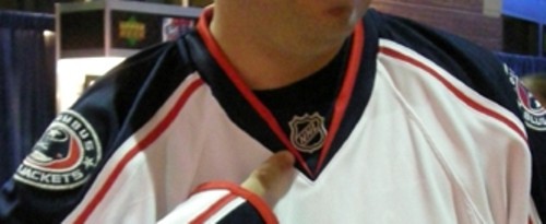
Know what part I didn’t care for? No, that’s not a shirt underneath…
That’s part of the jersey. (I am wearing a dark shirt, so look for the line above the NHL logo for the cutoff point). I don’t really care for it, but it didn’t touch the throat as I thought it would. I was expecting a choking effect, but was happy to find otherwise. I’m not sure how that’s going to look with the Bruins jersey with the lace up on the front. But I do approve the design of their jerseys.
I do a little dance on the catwalk…
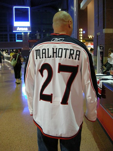
The shape isn’t as bad as I expected, but owning one would motivate me more to work on losing the beer gut. It certainly isn’t the traditional jersey cut, and I love the cut of the old jerseys. It’s part of why I own so many. I suspect those audience members who like the covering or blanket-like effect of the current jerseys will not be to thrilled with these. Notice how high the fight strap is (bottom of the numbers). On a taller player with shoulder pads, that thing is going to be up way there. I didn’t check out how long the strap is, but I assume Zdeno Chara is going to need one three feet long.
The new material is a winner in my book. It was soft (still not as soft as the Lutch Russian jerseys I have), felt durable, and didn’t seem as prone to snags as the Air-Knit of current jerseys. A snag can ruin a good jersey, especially a game worn (you just can’t stop thinking about it). I can’t talk about the moisture resistance part, as I did not have a cup of water handy.
I did have a source, who shall remain anonymous (unless he wishes otherwise) that told me the replica jerseys (which will not be called replica), will have a printed patch, not a stitched patch. They are still, make a funny noise, and look like garbage. I am guessing that this is to get people to but the authentic jerseys. I also expect the reason will be the cost associated with making real patches at the price point of the new jerseys. Not exactly a crowd pleaser.
But I’m just a fan. I’m not the guy in pads trying to play in the thing. I would imagine that the thing would look better with shoulder pads on, but not so much with large elbow pads on. Look at the All Star Game to see what I mean. Most of the players looked like Robocop.
I took a lot of pictures of the new RBK EDGE system of pads, and will share them soon. For now, my jerseys review stands at a middle of the road 3 out of a possible 5 fight straps. Not a major for cross checking, but not an overtime game winning goal either.


8 responses to “New Blue Jackets Jersey: Not Exactly Slimming”
I was looking at getting an All-Star jersey last season, because holy shit are those jerseys soft. I don’t remember if the crest was a proper crest or a printed one, now, though I suspect it may have been in some fashion cheaper. Anyway, the main reason I didn’t get one at the time is because I had no money, but come September, when the Hitmen season starts up again and I have access to the jersey store at the Saddledome, I may just consider it.
This is the first time i got to see the back of a Columbus jersey… I like the number font a lot
Lookin’ good, Tapeleg.
I can’t say I’m a big fan of the number font or the lettering style, but I am a fan of Manny Malhotra’s name. Personally, I think it’s more of a baseball name than a hockey name, but it’s still cool.
Thanks for taking the time to model the jersey for us. The sleeves look much narrower than in the old “sweaters”.
D2K – I saw a replica all-star jersey recently, and it was the printed patch.
DLS – The sleeves are narrowed than the previous models. I’m sure that won’t make goalies too happy (I’m sure they have larger arms for the goalies).
at jibblescribbits you mentioned a spike in hits for this article.
I posted a link to this entry in the chris creamer boards the other day. mystery solved?
DD – Yep, that would be it. Thanks. Broke the single day record for the site.
Love the number and the font, but not the most flattering item of clothing is it???
Wow, I very like the number font a lot, it looks great! I have to admit I am a big fan of Manny Malhotra’s name!