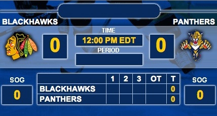
If you have to follow games online by the score sheets, as I frequently do, you get pretty familiar with the interface from NHL.com scoreboard. This year, in a never ending quest to “improve” their product, the NHL has changed their game summaries and “Super Stats” (now called event summery) into almost illegible fodder. And on top of that, they have done away with the shift chart. See?
Gone is the little chart with green lines that showed when each player is on the ice. It gave a good overview of what was happening, and was pretty easy to read. What do you have now?
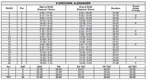
OK, so you get some serious detail right? What does that look like for the entire game, for just one team?

Wow. And that’s just one team. That’s great and all for the cut and paste stats junkies, but that doesn’t replace the Shift Chart. I mean, I just want an overview, not a complete novel every game. Is there a problem with keeping them both?
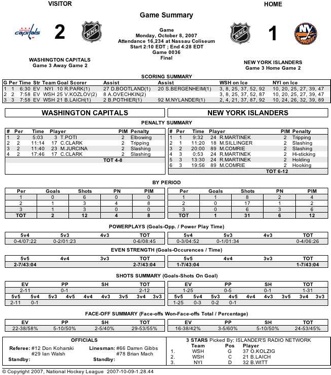
And then we have this little problem.
Click on that, if you want, make it bigger. Hey, know what you won’t find? Any info about the goalies. That is, unless you know their jersey numbers. Then you can find out if they were on ice for a goal. For that kind of info, you have to go to the new and “improved” event summery:

I like having this type of info, but can’t we just make it easy, and keep it on one sheet? Make life easier on us hockey fans, OK, NHL.com?
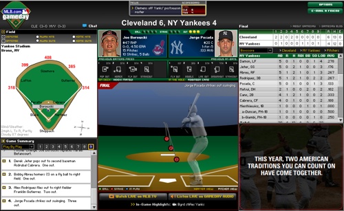
Sure, it’s small stuff, but when you go to the other major sports leagues websites, they bend over backwards to keep you in the game online. Such as:
That’s what it looks like during a game on MLB.com. Compare that with:

Yawn. Sure, they are two entirely different sports. Baseball is a game of slowness, while hockey doesn’t have time for no jibba jabba. Gotcha. And you know, god bless them for trying and all, but have you seen what the NCAA is doing with it’s real time game info? Blows you away. When it starts up, I’ll put up some examples.
So, basically, what I’m saying here is, bring back the shift chart, and put the goalie info back on the game sheet. I have enough to deal with without having two different sheets that are out of sync to keep track of. Thanks, NHL.com, that would be a great help.


4 responses to “NHL.com Scoreboard: What Happened to the Shift Chart?”
interestingly, the Avs recaps (http://avalanche.nhl.com/team/app/?service=page&page=Recap&seas=20072008>ype=2&gnum=35)
still have a spot reserved for the shift chart. I’m thinking that’s just an old template, though.
I’m working on a little program to create a shift chart from that bulky TOI list. It’s turning out to be a lot easier than I thought it would be – I just need to find some free time to get it finished.
And, while we’re ragging on the new stats, we should mention they are also still riddled with errors. For example, in the Avs/SJ game (http://www.nhl.com/scores/htmlreports/20072008/GS020035.HTM)
Sakic’s first goal is listed as EV, even though they were on a 5 on 3. There’s other mistakes as well…which makes it really hard for me to start collecting stats from them.
Surprising to see the NHL mess something up like this. They are normally on the ball…
Somebody at nhl.com was THINKING
At first, I thought it was just my imagination that these things were missing. And then I was thinking maybe it was just for the preseason. And now I am hoping it is just because it is early in the season.
But yeah, it sucks!
Draft dodger i would really like to be informed on this shift chart program your working on when it’s finished.